Our References
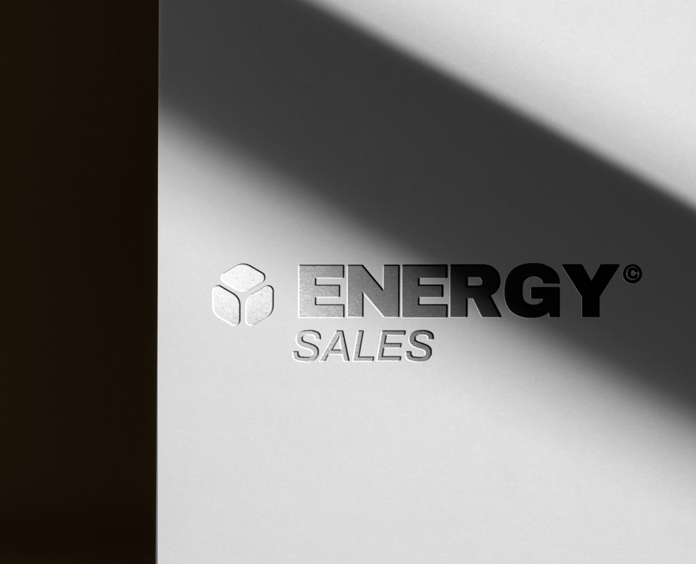
Energy Sales Logo
The logo design for Our Energy Sales transcends mere aesthetics to embody a powerful statement of the company's identity and values within the energy industry.
Through the integration of elements symbolizing dynamism, strength, and innovation, the logo acts as a beacon, reflecting Our Energy Sales' dedication to advancing progress and delivering impactful solutions in the energy sector. Its modern design, coupled with symbolic imagery, encapsulates the essence of the company's mission: to infuse the market with energy and vitality, thereby inspiring confidence and trust among clients and stakeholders.


Project Description
Features:
Dynamic Imagery: The logo incorporates vibrant and energetic visual elements, symbolizing the company's active role in the energy sector and its commitment to continuous innovation.
Strong Typography: Robust and contemporary typography is used to convey strength and reliability, key attributes that Our Energy Sales upholds in its operations and relationships.
Innovative Design Elements: Unique design elements are employed to represent forward-thinking and cutting-edge solutions, highlighting the company's position as a leader in the industry.
Color Palette: A strategic color palette is chosen to evoke energy, trust, and progress, reinforcing the company's brand message and appeal.
Versatility: The logo is designed to be versatile, ensuring it maintains its impact and legibility across various mediums, including digital platforms, print materials, and promotional items.
Target Audience:
The Energy Sales Logo is aimed at a diverse audience including:
- Clients and Partners: Companies and individuals looking for reliable and innovative energy solutions.
- Stakeholders: Investors and industry professionals who seek assurance of the company's commitment to growth and excellence.
- Employees and Prospective Talent: Individuals who resonate with the company's values of dynamism, strength, and innovation.
Results:
The creation of the Energy Sales Logo has fortified the company's brand identity, making it instantly recognizable and synonymous with energy and innovation. Feedback from stakeholders has been overwhelmingly positive, with the logo being praised for its modern design and powerful symbolism. This has led to enhanced brand perception, increased client trust, and a stronger market presence, ultimately contributing to the company's growth and success in the competitive energy sector.


